Sample Case Study
Project: Find a store near me
Prepared by: Karen Douglas
Note: This is a bit more theoretical than my actual Case Studies, as this is a sample project. I’m going to walk you through the process which my team and I would go through as we work together to create this flow.
Creative Brief
Develop UX for desktop and mobile (no tablet) that promotes our in store offer.
Create a page to communicate the offer, why it’s compelling, why should they work with us, and a conversion CTA.
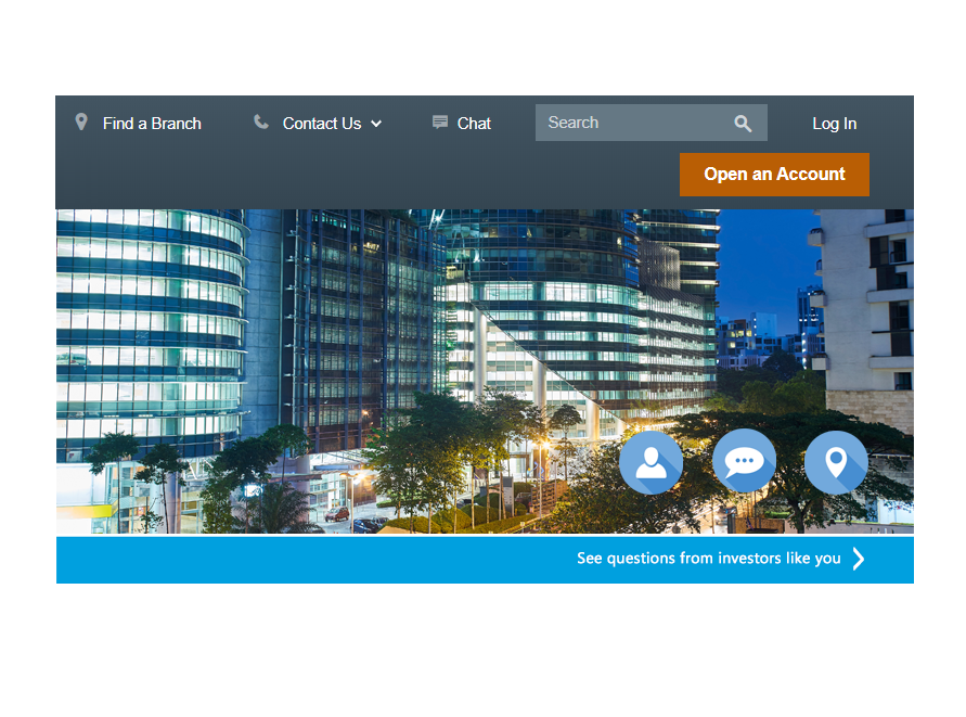
ABC Company is offering a FREE investment consultation for retail clients in participating locations. Traffic will be directed to the FREE investment consultation landing pages for online appointments.
1. UX Strategy and Roadmap
The goal of user centered analysis and design is to discover and analyze the data to make informed design decisions. First we need to:
- learn about our customers at every stage of the development
- find out what our customers want to accomplish
- validate that our products work, meet expectations and improve customer perceptions.
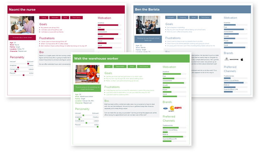
Research: Design Brief and attachments, competitive review of ABC Company, Edward Jones, and Charles Schwab’s sites. Personas developed based on rules and info obtained on IRS.gov, from provided information and info gleaned from competitive research.
- High school student 14K
- College student 14K
- Single Adult
- Entry Level job 50K
- Blue Collar worker 56K
- Entry Level Nurse $65K
- Desktop and mobile users
Methodology
- Kick off meeting to gather requirements
- Define your goals (Design Strategy)
- Identify and describe your users (Profiles and Personas)
- Learn about your users (Data Gathering)
- Document what you’ve learned about your users (Updated Personas and Scenarios)
2. Visual & UX Design
Translate complex concepts and ideas, first into user flows, then wireframes and finally into polished HTML prototypes.
This is where we get to take the insights gained during the discovery phase and figure out how to put it all together, balancing the user’s need for clarity with the business goals and the technical challenges of implementation. I often start at a whiteboard, virtual or otherwise, with the Product Owner, Business Analyst and sometimes even a Tech Lead or two. I’ll present the findings and we’ll work through solutions using quick and dirty methods on a whiteboard. It saves time and money by ferreting out issues with the flow and interaction/behaviors of the site, issues that one person alone wouldn’t be able to discover. It takes the collaboration of the team to make a great product.
Once you have a viable design you will want to begin user testing, as early in the process as is feasible.
Deliverables
- customer journeys
- user flows
- whiteboarding
- sitemaps
- wireframes
- prototypes
- User Testing
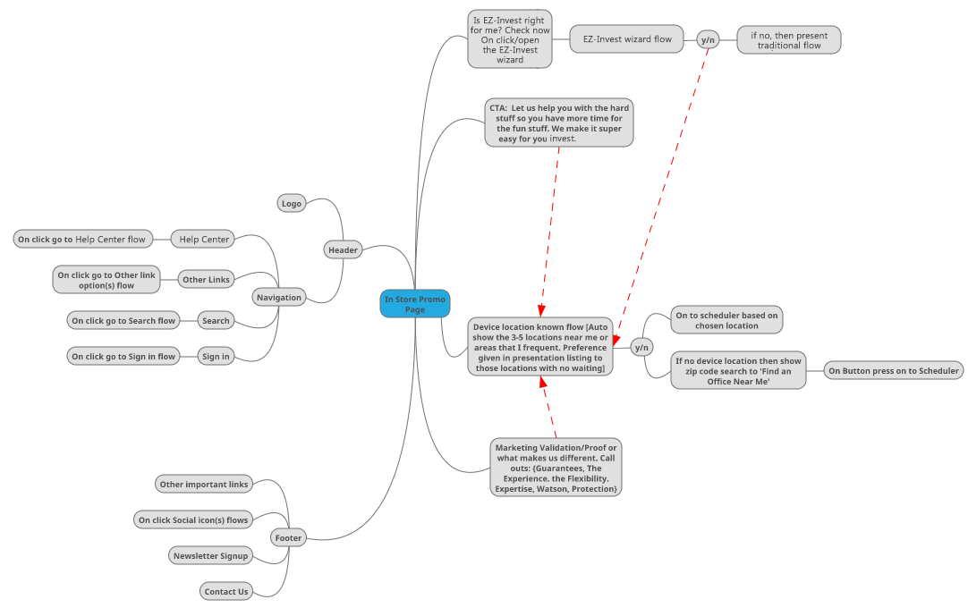
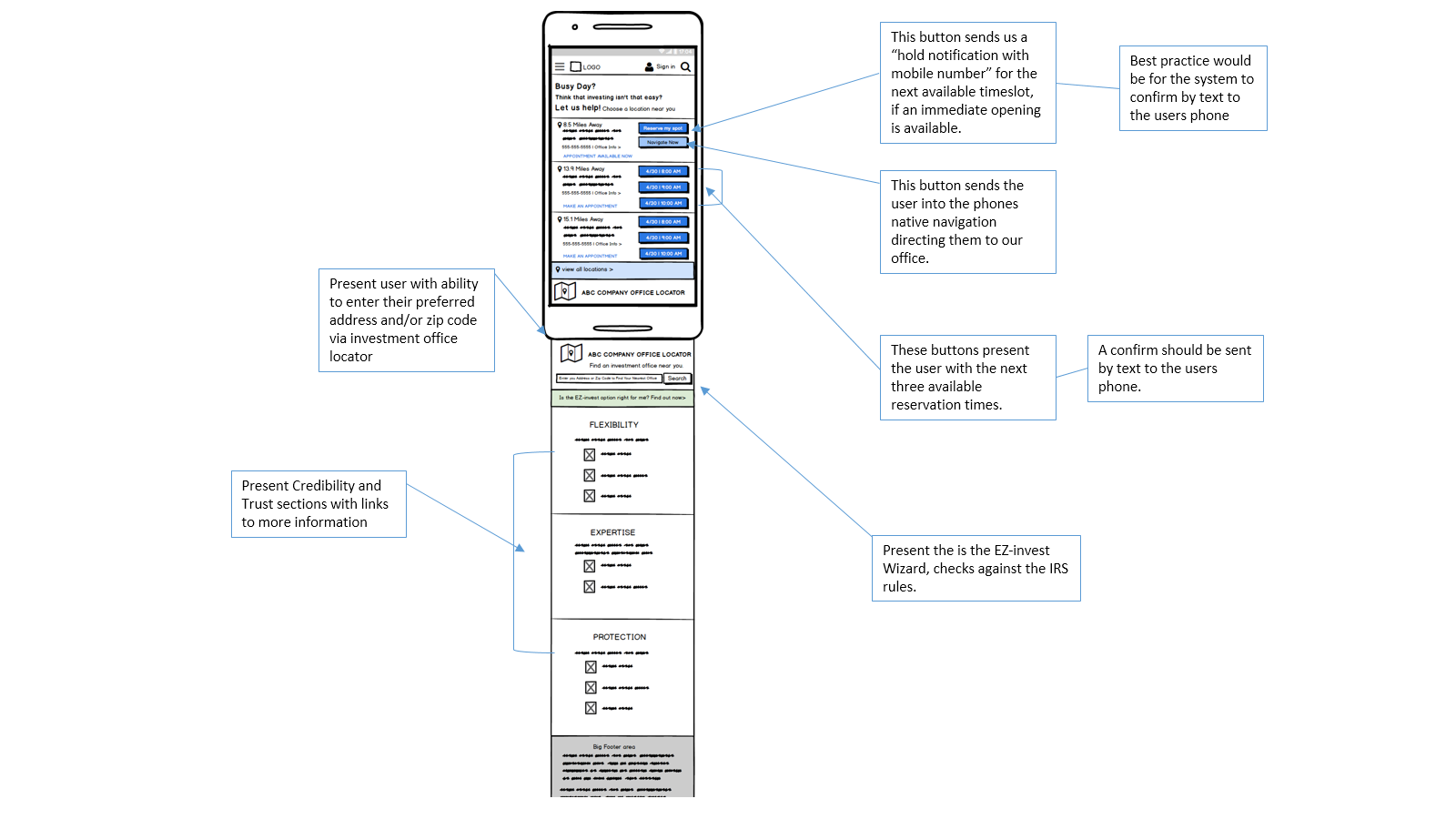
Wireframes:
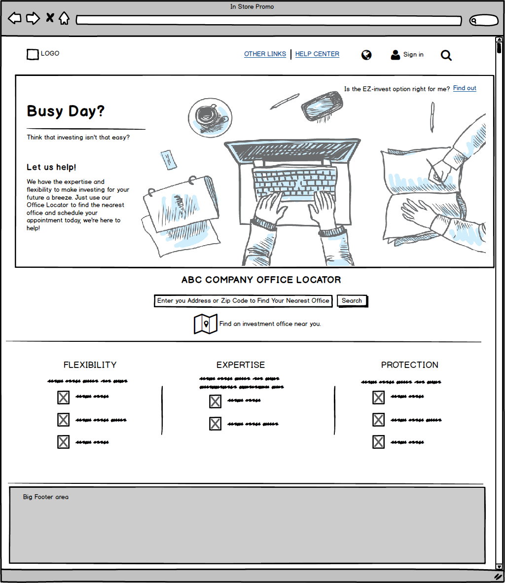
Desktop flow
Scenario: no known device location
Notes:
One of the key findings during research for persona development is that all of our users are very busy people. They each have very specific reasons why setting up an investment plan just wasn’t easy for them.
Knowing this, then the key idea is to acknowledge that they are swamped and that we can help them. All they need to do is find the investment office nearest them – so we present the investment office locator front and center. This uses existing page flows.
Building credibility and trust takes second place on the page real estate to the immediacy of getting this hassle done and out of their hair. Which is why those elements are implied in the call to action but supported lower on the page.
In the mobile mockup, we’ll take the speed up a notch and do predictive suggestions based on the device location.
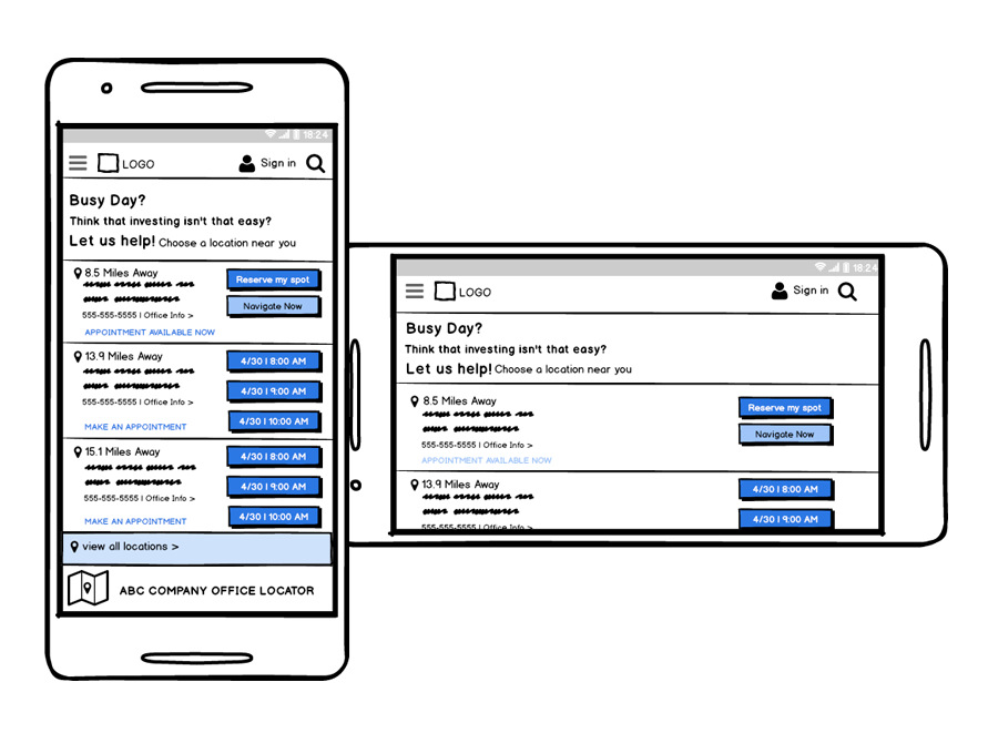
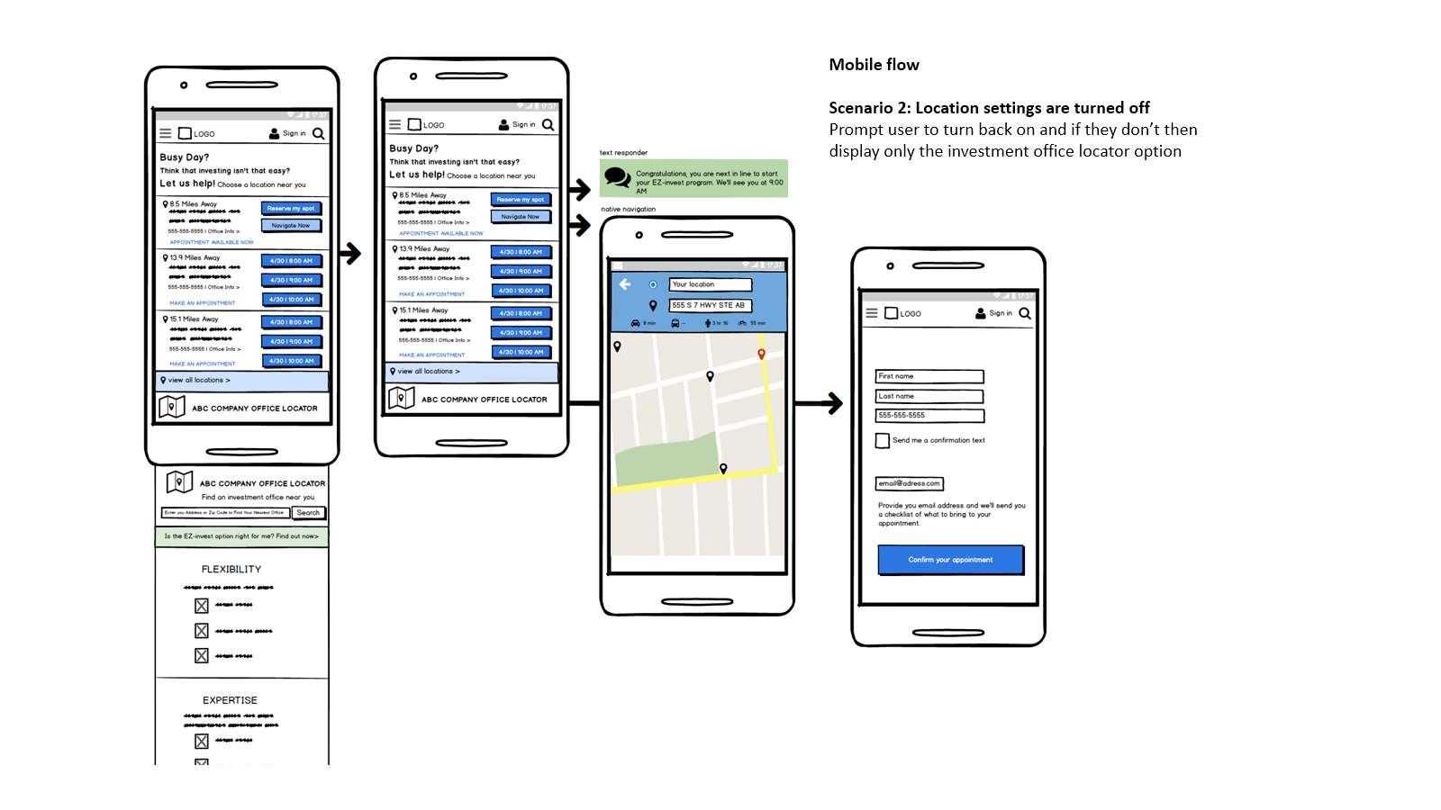
Mobile flow
Scenario 1: known device location
Notes:
The concept is that if someone searched for help investing or got here via a promo email then we should present them with the closest location to where they are, or where they live or where they drive on a daily basis with priority given to locations with immediate openings.
If say, there is an opening for an appointment within a yet-to-be-determined mileage, say 10 miles, we would present them with a button to make the reservation and one to quickly send them into the navigate mode.
If only appointments are available then present 3 soonest options to reserve a space.
Else, they can opt to view all locations on a google map and choose their own location or enter their address and time frame via existing flow of the investment office locator and scheduler.
3. Development
This stage, in my opinion, is the right time to share early concepts with your dev team.
If you are embedded in an Agile team, you would already have had a discussion with your Tech Lead and BA about any big blockers to the concept. Otherwise, I suggest you borrow from that methodology and invite your Tech leads, BA, QA and Scrum Master to a discussion with you, your designer and your PM to review the early wireframes and flows. This really helps with buy-in and a sense of partnership between business and tech. It also allows design and dev to avoid costly mistakes because of miscommunication. Once an agreement is reached by all parties, final designs and prototypes can be built.
Mobile Annotations:
Mobile User Flow
4. Launch & Monitor, Then Repeat
Once the product ships then it is time to watch the user’s on site behavior, and begin the user testing process again:
If this had been an actual product released into the wild, I would work with our data analysts and user researchers to synthesize various data inputs with industry trends and competitive research to drive improvements to this product.